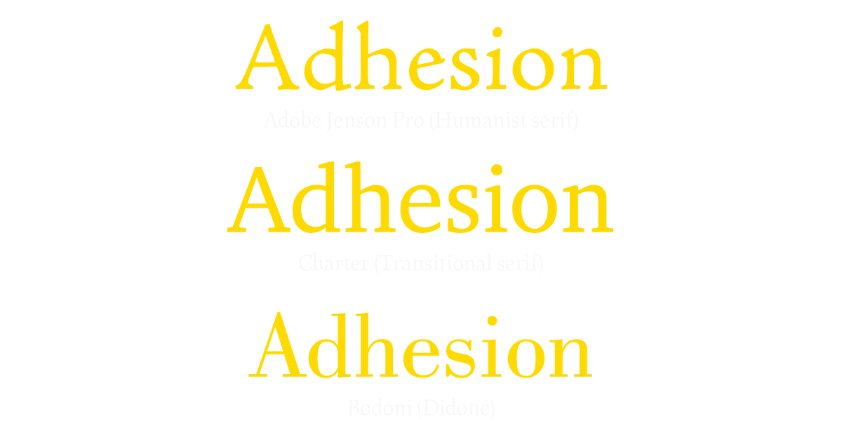
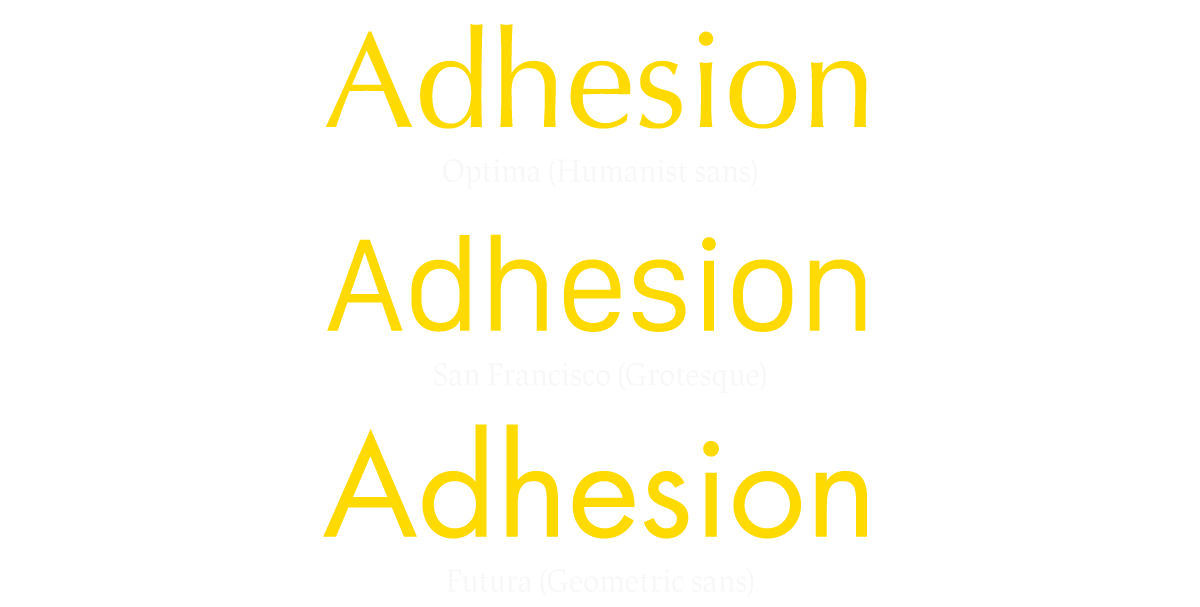
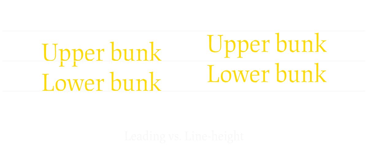
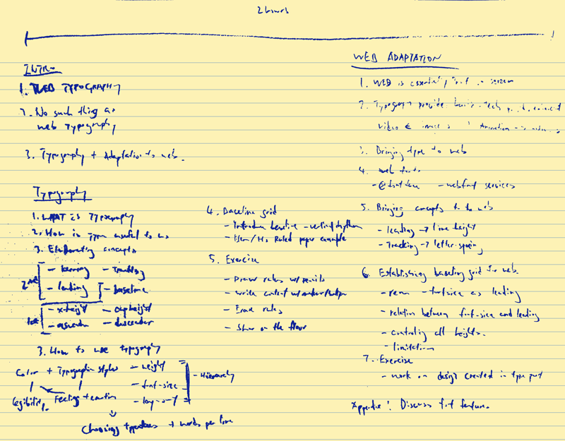
The Adaptation of Typography in Web

Junior Form Function & Class 2015

September 26, 2015

About myself

Expectations

Web typography

Web typography articles

In my honest opinion—There’s no such thing as web typography.

Web typography is the adaptation of practical typography to the web environment.

Typography, & the adaptation to the web

Typography

Typography is the visual component of the written word. Ty­pog­ra­phy per­form a util­i­tar­ian func­tion.

Everyone is doing typography with or without noticing.

Casual sketch

Casual sketch 2

Casual sketch 3

We’ve been practicing proper typographic layout all our lives without even noticing.

Proper typography is used for conveying a written message as accurate and as effective as possible.

Illegible sign

Poor hierarchy

Accuracy of typeface

Legibility
+
Clarity
+
Accuracy
=
Good typography

Typeface vs. Font

Typeface is how you call the design.

Verdana, Helvetica, Arial, Garamond, Gotham, and Proxima Nova

Font is the software you use.

verdana.ttf, helvetica-neue.otf, arial.ttf, garamond-pro.otf, gotham-regular.woff2, and pn-bold.eot

The Anatomy of Type

Hamburgefonstiv

Baseline

X-Height

Descender

Ascender

Cap height

Leading, Kerning, & Tracking

Leading is the distance between lines of texts.
It has the same value as the distance between baselines.

Bunk bed

Leading = font-size × ratio
or
Ratio = leading / font-size

120% – 145% is the optimal value of the ratio. Body texts need higher leading than titles to ensure the legibility of texts.

Kerning vs. Tracking

Kerning is the distance between two glyphs(or characters).

Who are you closer to? Are you a “Mommy’s boy” or a “Daddy’s boy”.

Tracking is the spacing applied throughout the whole word.

How close is your family as a whole?

Kerning

Tracking

Designing with typography in mind

Typographic style sets up the emotion and context of the content.

Types of serif

Types of sans

Humanist typefaces generally has the classic warmth in it.

Didone and geometric sans has the classy futuristic feel.

When in doubt, play safe with a humble transitional serif or grotesque.

Hierarchy

Content are generally divided into two parts—Title, and body.

Always give contrast between title text and body text.

Contrast with weight

Contrast with font size

Contrast with change of type

Contrast creates distinction.

Similarity creates confusion.

Mix typefaces with difference clear enough for people to notice easily,

or don’t mix typefaces at all.

Vertical rhythm is the secret in maintaining a clean layout.

Create vertical rhythm by establishing a baseline grid

Baseline grid 1

Baseline grid 2

Baseline grid 3

Baseline grid 4

Baseline grid 5

Baseline grid 6

Download the materials:
http://aclr.co/presentations/the-adaptation-of-typography-in-web/web-type-exercise.zip

Web adaptation

Web has provided a new platform for contents to be more accessible.

Web is basically print media evolved to be shown on screen.

Mashable

Mashable

Images became videos

Interactive elements are added

But, texts are still texts.

Typographic concepts are gravely applicable to the web environment.

Web fonts

@font-face & web font services

@font-face

Method to link web browser compatible fonts(which are usually different from desktop fonts) to your CSS file, so you can use the fonts on your website.

Most supported font format is the Web Open Font Format (woff).

@font-face

@font-face {
  font-family: 'Inovato'; // Name of the typeface
  src: url('path/to/file.eot');
  src: url('path/to/file.eot?#iefix') format('embedded-opentype'),
       url('path/to/file.woff2') format('woff2'),
       url('path/to/file.woff') format('woff'),
       url('path/to/file.ttf') format('truetype');
  font-weight: 400;
  font-style: italic;
}

Web font services

Web font services rely on the @font-face method as well. The way how web font services work is usually by providing you a script—which you need to include in your website—for side-loading a css file with some generated @font-face rules in it.

Fonts are usually served from the service’s server. Sometimes the fonts are included in the @font-face rules in base64 format.

Google Fonts

<link href='https://fonts.googleapis.com/css?family=Open+Sans:400,700,400italic,700italic' rel='stylesheet' type='text/css'>

Typographic settings on web

Leading became line-height

p {
	line-height: 18px; // Using px
	line-height: 1rem; // Using rem
}

Difference between leading and line height

(line-height - font-size)/2 then added to the top and bottom of em square.

Tracking became letter-spacing

h1, h2, h3 {
	letter-spacing: -1px;
}

Kerning

There are still no standard way of enabling kerning on the web.

h1, h2, p {

	// Will enable different features like kerning and ligatures
	text-rendering: optimizeLegibility; 

	// Will enable the feature stated. In this case, kerning.
	font-feature-settings: "kern";

}
Browser text-rendering font-feature-settings
IE10 × Yes
IE11 × Yes
Chrome Yes Yes
Firefox Yes Yes
Safari(OSX, iOS) Yes ×
Opera 15 and up Yes Yes
Android 4.1 Yes ×
Android 4.2 × ×
Android 4.3 × ×
Android 4.4 & up Yes Yes

Info from http://blog.typekit.com/2014/02/05/kerning-on-the-web/

Baseline grid on the web

Grid first approach

instead of setting up heights by guessing and visually testing, the grid first approach helps us to establish a clear rule on how vertical elements should behave.

To do this, we use rem as the standard unit for all vertical values like line-height, margin-top, and height.

The rem unit

rem means root em, it is a unit relative to the font-size set at the root element(or, html). The advantage of using rem is you can define all the rem values based on only one delared value.

html {
	font-size: 18px;
}
div {
	margin-top: 1rem; // equals to 18px
	padding-top: 2rem; // equals to 36px
}

Establishing the virtual grid

The baseline grid is built with a constant value—Leading. We need the leading present throughout the whole website. The best way to do this is to set it as the font-size of html and use the value with rem.

Establishing the virtual grid

With the leading set up, we’re drawing virtual baselines every time we uses the rem value for vertical elements.

For example, when you write img { height: 3rem; }, you’re telling the browser that the image should occupy a vertical space equivalent of three times the leading.

Demo: http://codepen.io/chakler/pen/ojYLbL

Now go ahead and try on the techniques. Open the files and start editing.

I hope you’ve learned something from this workshop today

Remember typography is something that needs constant learning and practice. Don’t stop!

If you have any question, send me an email at hi@aclr.co or tweet me at @chakler.

Also, remember to join the PWDO and Type Philippines facebook group to learn more about web and type.