The state of typography in the Philippines
Since Jessica Hische’s appearance in Graphika Manila 2014, there’s been a surge in calligraphy and lettering in the Philippines. Everybody is rushing to the nearest Scribe to get their own pen and ink, or maybe to NBS to get the nicest Sharpie. I have nothing against it. It’s great to see so many people sharing the same passion and interest. However, this should really be just the starting point of something better, something that goes beyond just art, something functional, something called typography.
It’s not wrong to say calligraphy and lettering are part of typography, but they are not typography. The three are related in a way like an evolution. Not so clear right? Let’s clarify the concepts:
First
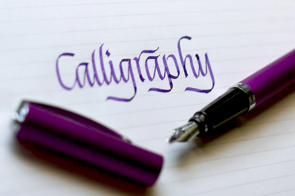
There is calligraphy, which is an organized form of handwriting with brush or nib. If you think about it, it’s actually the most basic form of typography as it provides the basis for the letterform used in typography. Without letterforms, typography won’t even exist.
Second
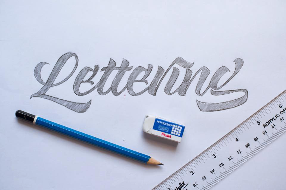
There is lettering, which is created with multiple strokes to mimic the essence of a letterform. It gives calligraphy another layer of freedom and hence provides the opportunity to create more variations to letterforms.
Third
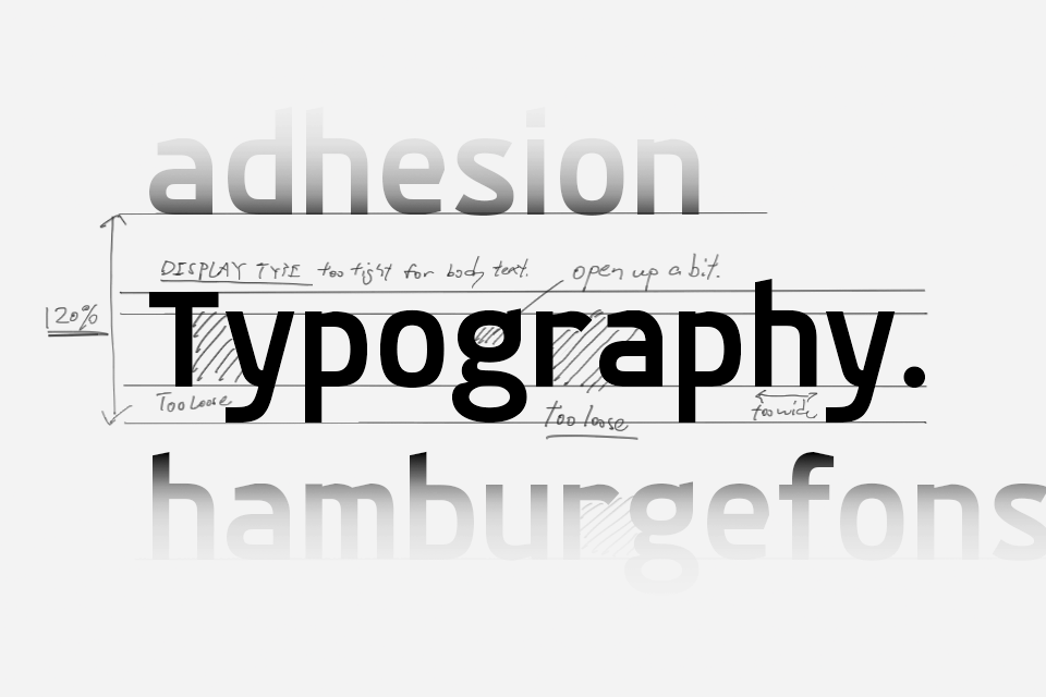
There is typography, which are rules and techniques that ensure and enhance the functionality of letters and texts. The scope of typography is very wide and diverse, it goes all the way from the proper specs of a glyph to how to properly layout texts. The key questions are always “Is it legible?” or “Does it help to communicate?” In short, typography keeps the letters and texts—or the design in general—away from causing troubles.
As you can see, calligraphy and lettering are important to the development in typography, but clearly there are differences between them. Calligraphy and lettering are leaning on the artistic side and typography is all about the function.
So what’s the problem in the Philippines?
I’m not saying this is 100% true, but it certainly looks like people are stuck in the beauty of calligraphy and lettering and their understanding in typography is based duly on those two as well.
Try googling “Typography workshop Philippines”, I’m quite sure that calligraphy or lettering workshops are all you will see from the results. There is not even a single company offering typographic consultation service to companies. There is simply not enough understanding to what typography is really about.
We always hear people say they’re “type nerds“ or “type geeks” but all they care about is what kind of nib they need for writing copperplate or spencerian. That’s because they still haven’t evolved to care about the functionality of type. The styles and the artistic expressions are their primary concern in the so called typography—which is not exactly typography if you think about it.
As I’ve said before, calligraphy, lettering and typography works like an evolution—from providing aesthetic value to the letterform, to ensuring the functionalities and preventing the texts from causing troubles. From what I see, we’re still not advancing from the artistic state to a higher, more technical, more functional level. We’re still not moving forward in the movement.
So I guess the question now is—Are we ready to extend our understanding to the formal typography? I’d say yes. In this age it’s not even that difficult to acquire all that knowledge. Typesetting softwares are widely accessible. With services like Typekit, typefaces are cheaper than ever. Information about typography are all on the internet. We’ve even created a Facebook group for type lovers from the Philippines to share knowledge to each other. There are simply no reason to not learn more about typography.
The only problem is just the mentality of the people. Do they want to learn more and uplift the state of type understanding in this country? or they’d rather indulge in just calligraphy and lettering and never evolve?
We need a force to encourage people to at least try understanding typography. We need every real type lover to serve as a beacon in spreading the knowledge and creating an awareness. We need to move forward all together in this typography movement. That’s the way to uplift typography and graphic designs in general to a more functional level, and that’s how we should be creating values to good designs.
* Special thanks to Ia Lucero for proof-reading this article and Jelvin Base for creating the calligraphy and lettering example.